Logo

Note: Only the logo should use the ampersand. All other instances of Joni and Friends should be written with “and”.
Meaning and Reason
The new Joni and Friends logo represents our mission: to communicate the Gospel and equip Christ-honoring Churches worldwide to evangelize and disciple people affected by disabilities. The new logo also represents “friends” of the ministry and the people we serve. Designed in-house, we are launching the logo in 2019 as part of the 40-year anniversary celebration, also marking the start of a new era of global outreach. The logo icon can be read without words, understood in any language.
![]()
The “Global” Icon
- The circle represents the globe and our global ministry as we reach the world.
- The circle represents the completeness of God’s never-ending plan.
- Within the circle, abstract figures represent the Joni and Friends community of support: they support one another inwardly as they extend their arms outwardly to share the Gospel with the world.
- The abstract figures are also reading Bibles, representing our commitment to sharing the Gospel and providing biblically-based care.

The Logotype
We’ve rewritten the text to say joni&friends; this is now one word, written with an ampersand, to emphasize that we serve as one at the ministry. We also serve as one with our ministry partners and our friends around the globe.
Animation
The Gospel is central to all that we do; in video, a cross is animated in the “f” at the center of our logo.
“I never want Joni and Friends to be centered on me and my work; it’s about our mission together, all the ‘friends’ we serve, and the Lord Jesus Christ. As we celebrate our 40-year milestone, Joni and Friends is also entering a new era of global ministry… I am excited to introduce this new logo that represents our mission and the people we serve.”
“I am thrilled about this fresh new look for Joni and Friends as we lift upChrist and His Gospel.”
Typography
All headings should remain black unless they are hyperlinked. If hyperlinked, the heading color should be Joni Blue (#0075C9) and the hover state color should be Hover Blue (#1B95DE).
Linked Heading
Heading One
45 pixels
Neue Haas Grotesk Display Semi-Bold
Heading Two
36 pixels
Neue Haas Grotesk Display Semi-Bold
Heading Three
30 pixels
Neue Haas Grotesk Display Light
Body Text
18 pixels
Neue Haas Grotesk Display Regular
Paragraphs
Paragraphs that are longer three sentences or more should always be left justified. Paragraph widths should be no longer than 1000 pixels for easy readability.
Trademark Usage
The Wheels for the World Trademark needs to appear at least once per piece or per page.
Colors
Primary
Joni Blue
#0075C9
Black
#000000
White
#FFFFFF
Secondary
Deep Blue
#004E6D
Wave Blue
#94D2E8
Mint Green
#4ABFB0
Tertiary
Light Gray
#C6C8C8
Dark Gray
#636569
Khaki
#F2D09F
Cardinal Red
#E01A22
Citrus Orange
#F5821F
Sun Yellow
#FAD900
Accent
Background Gray
#EDEFEE
Hover Blue
#1B95DE
Accessible Colors
Having carefully planned color contrast ratio is important for users with visual impairments.
Tools:
According to WCAG Success Criterion (SC) 1.4.3: Contrast (Minimum), the visual presentation of text and images of text must have a contrast ratio of at least 4.5:1.
There are three exceptions to the 4.5:1 contrast requirement: large text, incidental text, and logotypes.
Source: What is Color Contrast and Why Does it Matter for Website Accessibility?
Accessible Color Combinations
Background: #0075C9
Contrast: 4.79:1
Background: #EDEFEE
Contrast: 18.18:1
Images
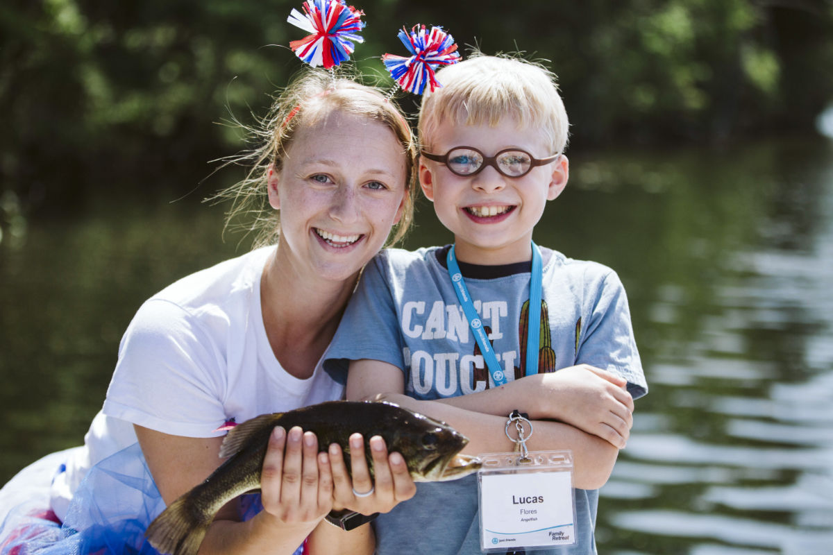
All images should be optimized before being uploaded to the website using a photo editing application like Photoshop or Affinity Photo. See Example
There are also web tools for image optimization available like TinyPNG and JPEGmini.
What Are the Benefits of Image Optimization?
While there are many benefits to optimizing your images, here are the top ones that you should know:
- Faster website speed
- Improved SEO rankings
- Higher overall conversion rate for sales and leads
- Less storage and bandwidth (which can reduce hosting and CDN costs)
- Faster website backups (which can reduce the cost of backup storage)
Source: How to Optimize Images for Web Performance without Losing Quality, WP Beginner
Blog Images
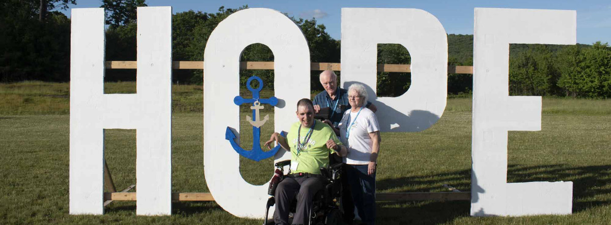
File Size: Should not exceed 500 KB
Dimensions: 1200 x 630 pixels
Aspect Ratio: 3:2
PPI: 72
Things to consider: It is important to consider the area above the fold (the visible part before scrolling) when choosing the size of the image. If the image is important a larger image size should be used. If the text is important the size of the image can be sacrificed.
Source: Best image size for websites in 2023, Tiny Img
Primary Banner
Primary banners are used for primary or top level page.
Secondary Banner
Use secondary banners for landing pages. (Example: The Perfect Gift)
Products
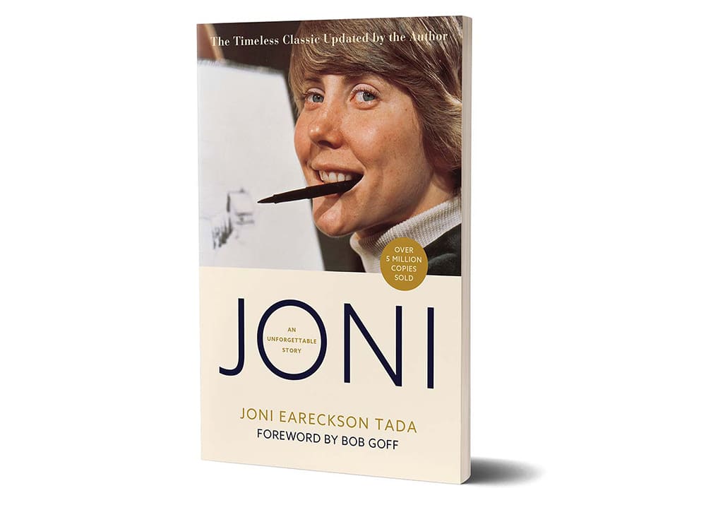
1000 x 715 pixels
Thin Banner
1400 x 350 pixels

Event Banner
1000 x 370 pixels

Image Optimization
All images should be optimized before being uploaded to the website. Learn how to optimize images.
Not Optimized for Web
This file was uploaded without being optimized for websites.
Image dimensions: 5,760 x 3,840
File Size: 2.2 MB

Optimized for Web
Image dimensions: 1,200 x 800
File Size: 162 KB


